Typefaces Classified: The Sans Serifs.
Humanist types share the hand-drawn qualities of oldstyle serifs. The proportions are similar including the greater difference between cap height and x-height. These similarities are clues to what you will find on the combinations page. The example above is Gill Sans. Other favorites in the Humanist style: Frutiger and Lucida Sans.
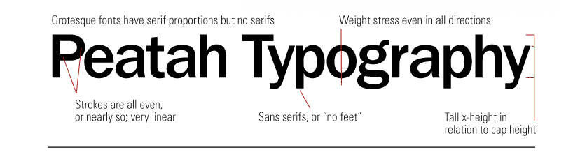
Grotesque types are designed with similar proportions and shapes to some of the serif categories such as Egyptians. (Also, a clue to what is covered in combinations.) Many of these typefaces have huge families of weights; so contrast can be designed using just the one typeface family. This example is ITC Franklin Gothic. Other favorites are Helvetica and Trade Gothic.
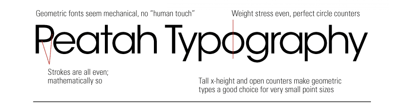
Geometric types have a real mathematical precision to their design with perfectly even stroke weights throughout. Perfect circles on the a, e, o, etc. Therefore, there is no tie with the hand-drawn letterforms shown on the serif page like the oldstyles. The example above is ITC Avant Garde Gothic. Some other favorite geometric sans serifs: Futura and Kabel.
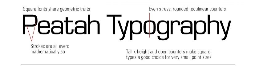
Square sans serif types could actually just get mixed in with the geometrics. They are also precise with even stroke weights and mathematical precision. They just have square forms rather than circular. The example above is Eurostile. Other favorites are Calcite and Industria.
Entire site and content © Copyright 2023 Kerry Scott Jenkins. All rights reserved.